May 16, 2024 ⋅ 4 min read
Accessibility Uncovered: Boosting iOS Apps with Reveal
Today is Global Accessibility Awareness Day, a perfect time to reflect on how we can make our iOS apps more inclusive. Imagine trying to use an app where you can’t read the text, interact with buttons, or navigate at all. Sounds unnecessarily frustrating, right? That’s still sadly the reality for many people who are dependent on assistive technologies in their life. But as developers, we have the power to ensure our apps are accessible and usable for everyone.
But let’s be real—spotting accessibility issues can feel tricky and overwhelming. That’s where the Reveal app by Itty Bitty Apps comes to the rescue! 🦸♂️🦸♀️ It’s my secret weapon for uncovering accessibility bugs that can slip through the cracks.
In this post, I’ll share how Reveal makes my life easier by helping to test and identify accessibility issues in iOS apps. It’s like having X-ray vision for your app’s UI! Let’s dive in and see how the tool can help you make your apps better for everyone. 🚀
Setting up Reveal App Locally
- Download Reveal – there’s a 14-day free trial option
- Link Reveal with Xcode
- Run the app
- Navigate to the feature in the simulator
- Open Reveal and select the app that you want to inspect
Unveiling the Magic of Reveal App
Alright, let’s get into the good stuff. ✨ Here are some of the features of Reveal:
1. Insights Workspace
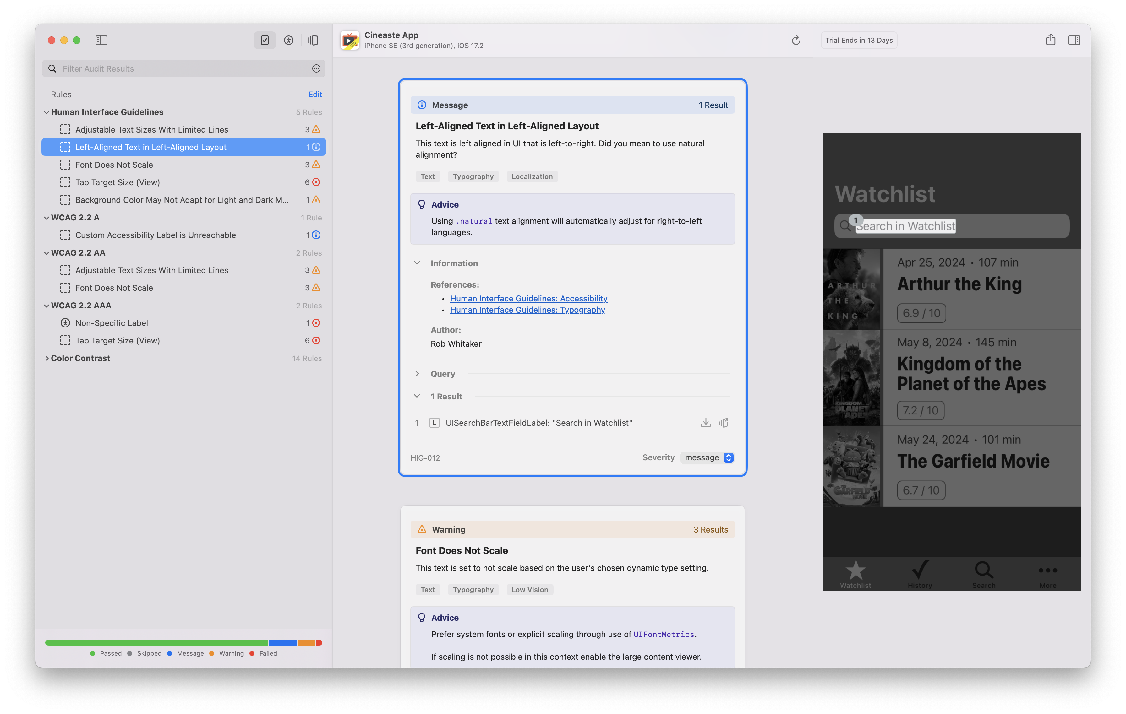
The insights workspace is a recent addition to Reveal (added October 2023). You can audit your app for best practices and guidelines with more than 130 rules that pinpoint areas of improvement. The rules include the following categories:
- Human Interface Guidelines
- WCAG 2.2 A, AA and AAA – Web Content Accessibility Guidelines how to make the digital world more accessible. As example, one of the criteria is that colors should not be used as the only way to convey content or distinguish visual elements. There’s a quick reference guide for an easier overview of the criteria.
- Accessibility Best Practices
- UIKit Best Practices, like broken constraints
- Color Contrast
The results will be sorted by passed, skipped, message, warning, or failed. Each rule has additional documentation and links to references, so you get enough context on how to act on the finding.
When to use it?
The insights workspace is especially helpful when you feel lost and don’t know where to start. Focus on the issues that have failed during the audit. But also remember “progress over perfection”, any improvement is better than no improvement at all.

2. Accessibility Workspace
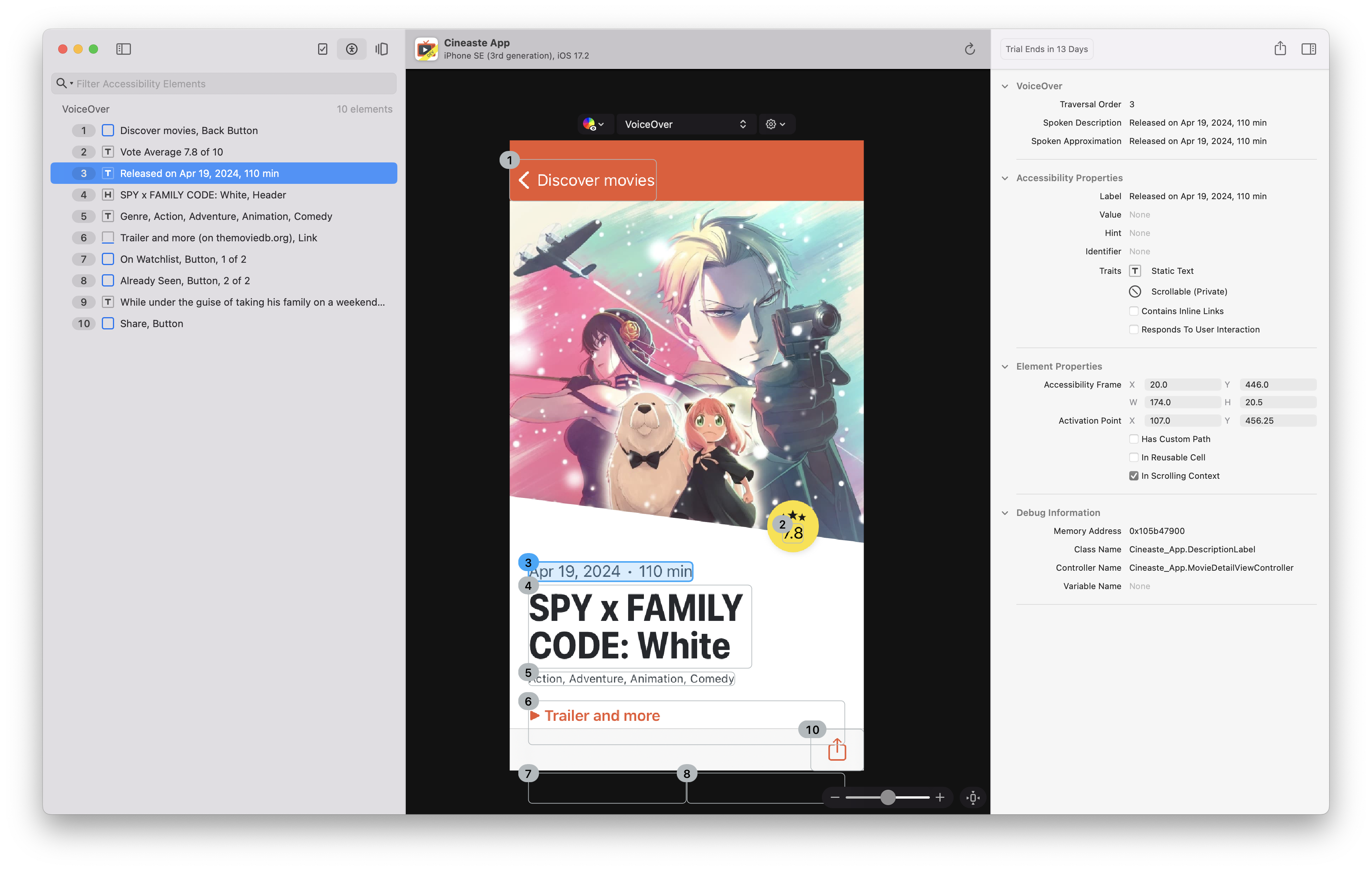
One of my favorite and most often used features is the accessibility workspace. It allows you to view accessibility properties in a nice visual interface together with your feature. You can check if all your UI elements have appropriate labels, traits, and hints and are configured as expected. Plus, you can see how VoiceOver or Voice Control will interact with your app (there’s a dropdown in the top area), making it a breeze to fix any issues. It even supports newer APIs like AXCustomContent, which is not supported in Xcode’s accessibility inspector.

When to use it?
I usually use it during development or when I fix accessibility bugs. Here are some of the criteria that I check:
- VoiceOver: Do all elements have a rectangle (meaning are they accessible to VoiceOver) or is an element missing?
- Voice Control: Do only interactive elements have a rectangle and a number? This is important to reduce clutter.
- Does the order of the elements make sense? Does it follow the visual order where possible?
- In the left column, are there elements with missing context e.g. “Button” only?
- In the left column, are there cryptic names, e.g. file names instead of semantic names?
- Are buttons marked as buttons?
- Are headings marked as headings?
⚠️ Note: Verify your features in Reveal during development or to find issues more quickly, but always test at least once on a real device with enabled assistive technology. There can be a mismatch between the generated view in Reveal and the real experience.
3. Layout Workspace
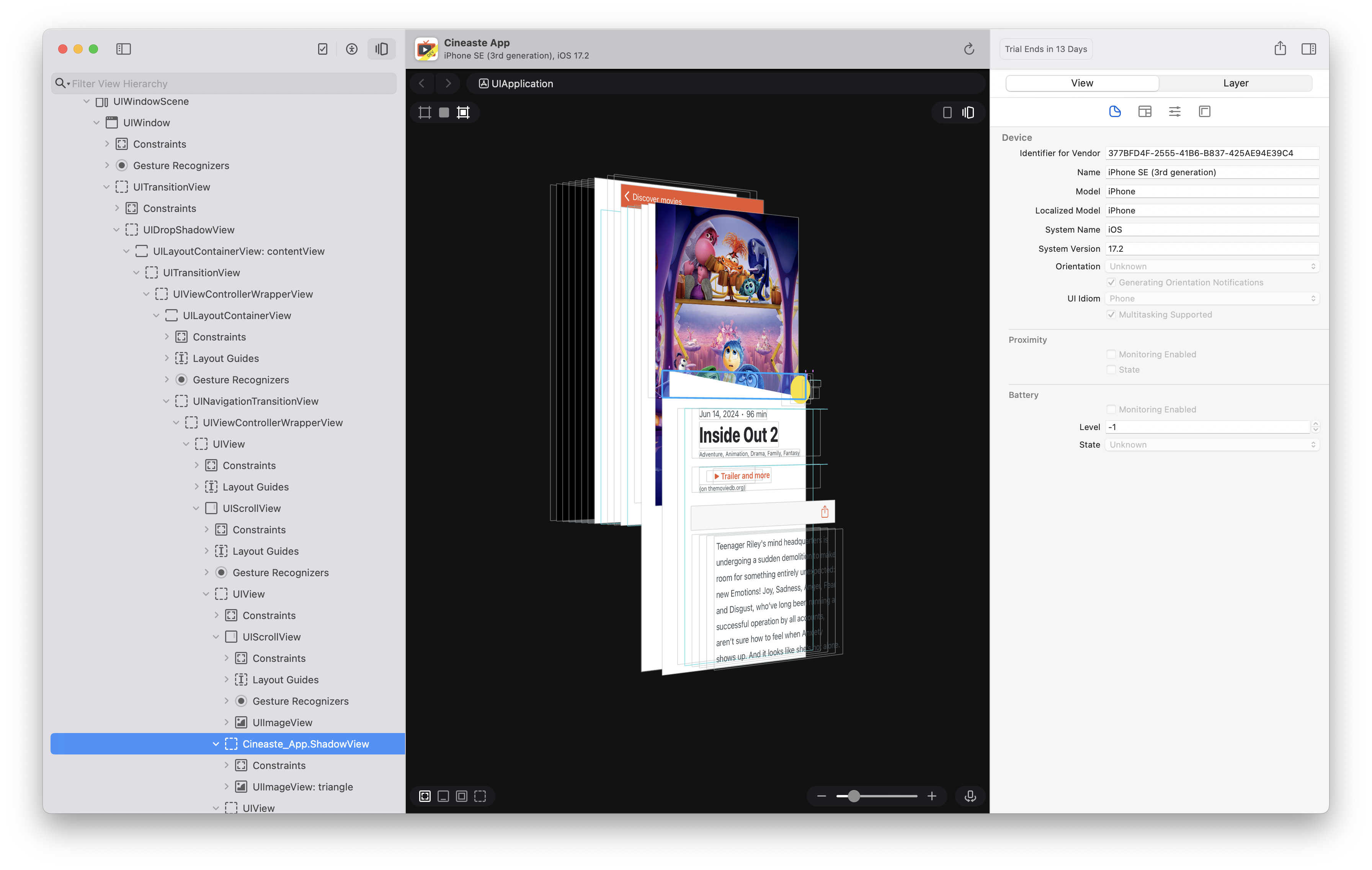
Reveal lets you see the entire view hierarchy of your app in real-time. You can inspect every element, check how they are nested, and ensure they are logically arranged. This makes it easier to spot layout issues, and debug the view hierarchy. This feature is similar to Xcode’s view hierarchy debugger, but with better support for SwiftUI views.

Wrapping Up
The Reveal app has been a game-changer for me, helping me build more accessible iOS apps with ease and confidence. As we celebrate Global Accessibility Awareness Day today, let’s commit to making our apps better for everyone. With tools like Reveal, creating inclusive experiences is not just possible but also incredibly rewarding.
So, give Reveal a try, and let’s make our apps accessible to all! 🌍✨