Mar 10, 2023 ⋅ 6 min read
A Sketchnote Worth a Thousand Words
Or... How to Write Image Descriptions for Sketchnotes That are Actually Useful
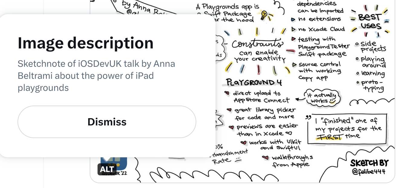
You should add image descriptions to images that you share online. Image descriptions are not only essential for screen reader users but they will also make images accessible when an image server is offline (looking at you Twitter 👀) or when you have bad internet connection. Read more about how to write image descriptions.
The option to add image descriptions is available on nearly all larger platforms.
Some example apps:
Important to know for developers:
- in iOS apps (set the accessibilityLabel),
- in Android apps (set the contentDescription)
- and of course for websites (set the HTML alt attribute on images).
If you find a social media platform that doesn’t provide the option to add image descriptions to images, you can describe the image in the message itself as workaround. Please, report this as a bug to the developers. I find that accessibility is not a feature that can be added at a later time in the product development. If a feature is not accessible, it’s a bug that needs to be fixed as soon as possible.
As you might or might not know, I love sketchnoting. It’s a brilliant technique for me to summarize content in a fun way, that makes it easy to stay engaged during a talk and also to make it convenient to look something up at a later time.
My Inner Struggle
I’ve always silently struggled with the conflict of trying to make the content that I create as accessible as possible and on the other side I create these completely inaccessible sketchnotes because they’re made of images and not text. I used to add image descriptions to the sketchnotes, but the descriptions were quite short and very non-descriptive. Usually it just was something like “Sketchnote about X, Y, Z” and that’s it.

I therefore talked to some of my colleagues in the Spotify accessibility team about my struggles with this. After listening to their input, it struck me that even though it means extra work for me and takes some time, I should add a more detailed image description to the sketchnotes so that everyone can access the content if they want to. I want to do better! Having a more detailed description would be valuable not only for screen reader users but for others as well. Especially because everything in the sketchnotes is handwritten, which makes it more difficult to read, and also the structure and context of the content is sometimes tricky to understand. Different ways of providing content are always the best solution anyway. This is also why you should provide subtitles for your videos and transcripts for your podcasts! But those are topics for another time.
The Problem
Almost all my sketchnotes contain a lot of text with some smaller sketches and containers to group the content. The more words the sketchnotes contain, the longer the image description – obviously.
Most platforms have a limit of 1000 characters for the image description, like Twitter or Slack. But this is not enough for most of my sketchnotes. When I tried to find a solution online, I found little information on how to write alt text for very complex graphics.
For images with graphs or statistics, the recommendation is usually to summarize and interpret the main message of the content rather than describe it. That’s good to know, but how would that apply to sketchnotes? Sure, I could try to find the one main statement to add to the alt text, but often sketchnotes are a summary of something bigger. Is it useful to add a summary to a summary? Is that good enough? I don’t think so. A large part of the content of the sketchnotes would be left out.
Even if the platform has no character limit, imagine listening to several minutes or more of voice output describing the complete image without any pause. There is no way to skip content, jump to a specific section or pause and resume the image description. It always starts at the beginning. Wouldn’t it be nice if the image description was in a semantic structure that offered all these functions? Something like a simple HTML page?
The Solution
My current approach for longer image descriptions is to publish them on an external page, e.g. in a Google document or directly on my website. The text will...
- be structured with several heading levels,
- make use of enumerations,
- and take advantage of all the other functionality to structure text.
After that, I can link to the page in the social media post together with the image. It’s important to know that you should not add links to the alt text directly, because it’s not possible for screen readers to interact with the link in the image description directly. The image itself will still contain a short image description like previously.
Another advantage of having the content of the sketchnote in an accessible and written form is that you can easily search the content, which is handy for me and also quite nice for search engine optimization (SEO) reasons.
So, the last days, I’ve updated my website to support longer image descriptions for my sketchnotes and the new more detailed descriptions will be displayed underneath the sketchnote on the detail page. You can explore my first sketchnote with a more detailed image description about Captions, Transcripts, Audio Descriptions, Sign Language Interpretation. Please, let me know what you think!
My new Workflow
- Create the sketchnote and export it as an image as usual.
- Open the image file in the macOS Preview app or the iOS Photos app.
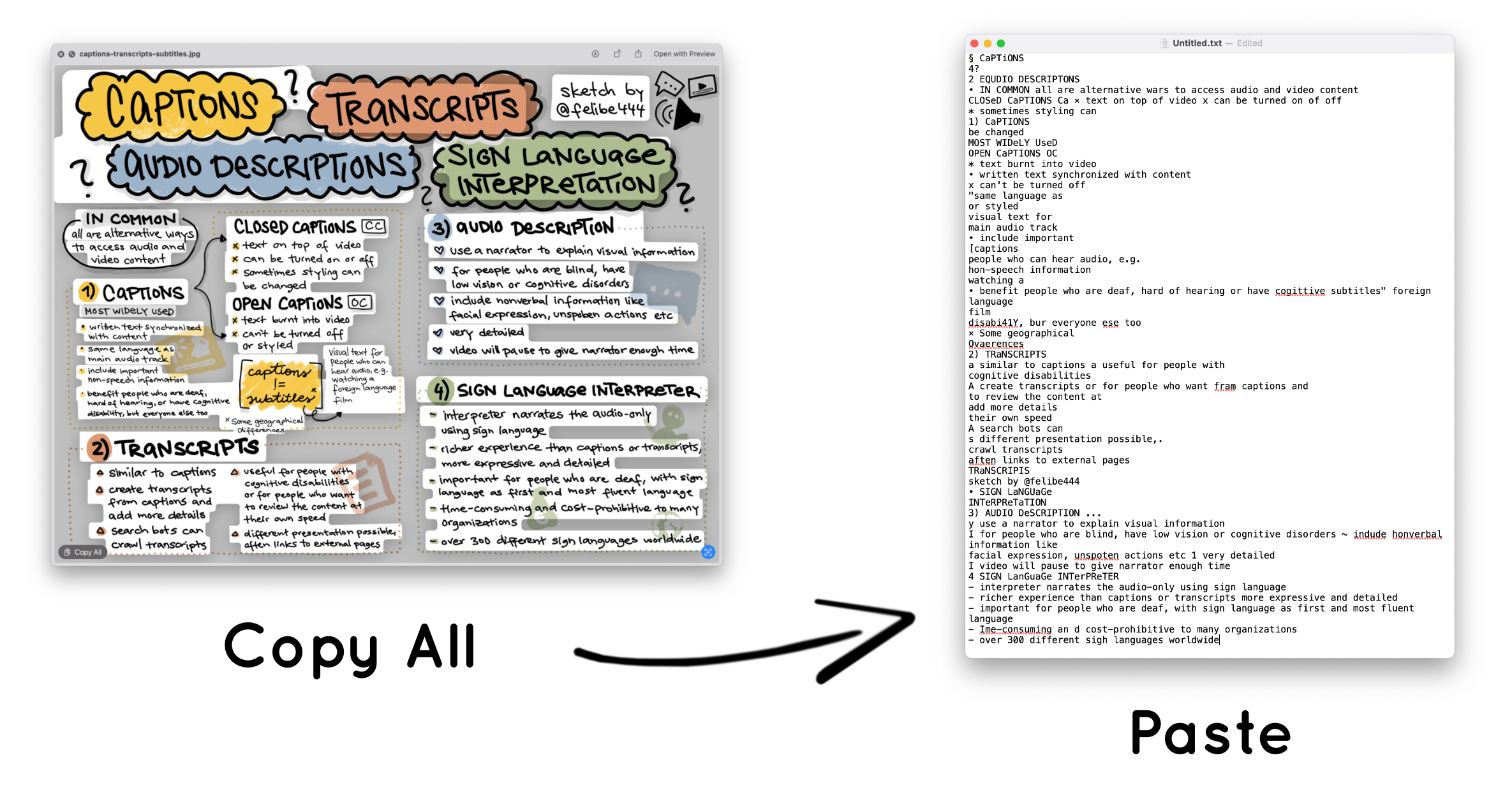
- Use the handy function to copy and paste text from an image (I love it).
Unfortunately, due to the structure of my sketchnotes, this usually ends up with the kinda right words but totally in the wrong order.

- Sort the text, so that it is in the right order.
- Fix leftover typos from the generated text.
- Add structure and semantic elements, like headings and bullet lists.
- Publish the new sketchnote with the image description on my website.
From now on, when I post a sketchnote on social media, I can add a link to the detailed image description on my website.
Phew, that sounds like a lot of work.... And to be honest, it is. It won’t be possible for me to publish sketchnotes with the detailed image descriptions when I do sketchnotes live at conferences for example. But I can always add a link with the longer image description afterwards.
But this new approach has some nice side effects too. It will give me a chance to walk through the content another time and just by that it will make it easier for me to remember it. Additionally the approach will calm my inner anxiety, and make my sketchnotes more accessible to everyone, and that is always worth the effort. If I can do something for inclusion (and I know how to do it), I will definitely go the extra mile.
Do you have ideas on how to improve this? Please, let me know! 💛